Designing the onboarding for a new TV experience
How the onboarding for a new NOS TV platform was designed, exploring flows, interactions, and interfaces to create an intuitive experience from the very first interaction
Summary
UMA TV is NOS’s main TV product, where I worked for more than 2 years as a Senior Product Designer. As part of its evolution into a multi-platform experience (STB, Apple TV, Android TV), I led the onboarding process for the product.
The first version didn’t perform well in user tests and, with a tight delivery deadline, we decided to take a simpler approach: contextual tooltips that introduce features along the journey.
The solution was validated in a round of usability tests with around 9 users and shipped with the new TV version to around 1 million subscribers.
Team
- Design Manager
- Nelson Delicado
- Visual Designer
- Renato Reis
- Product Designer
- Lucas Cipriano
- UX Researcher
- Lúcia Abreu
- Product Owner
- Mariana Marques
- Timeline
- 2024 → 2 months
- Platform
- TV STB, Android TV, tvOS
Problem
The product changed. Users’ habits didn’t.
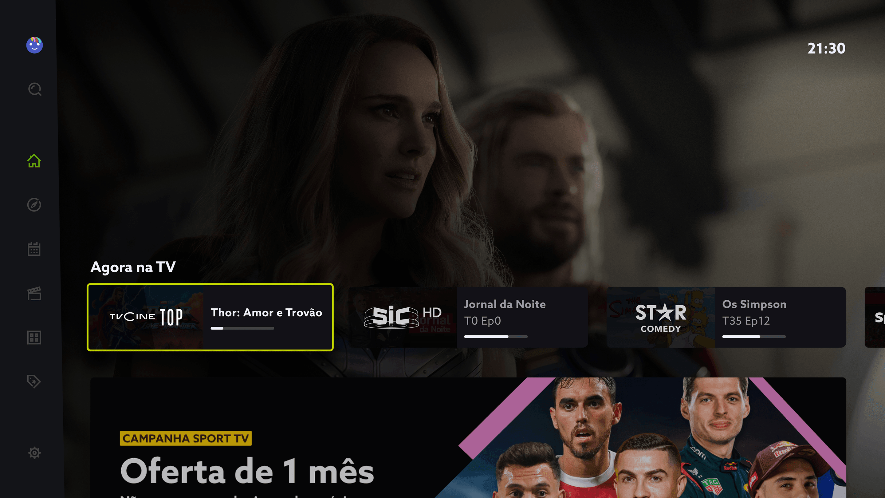
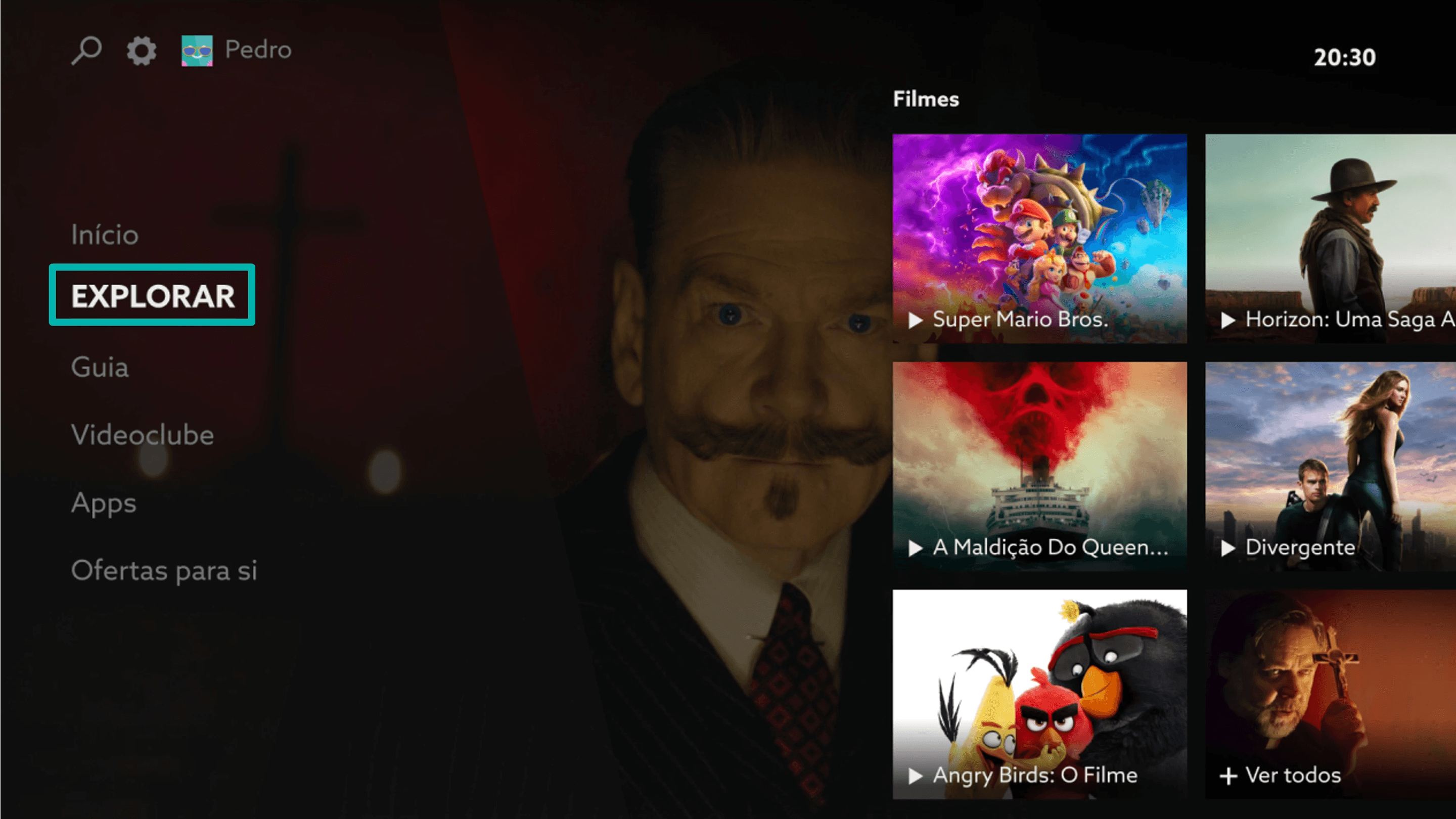
UMA TV has been on the market for more than 10 years, and its users built solid habits around it. The new version brings a completely different experience. For existing users, that means relearning what they had mastered. For newcomers, it means understanding a broad product all at once.
The challenge wasn’t teaching a new product; it was making the transition without losing anyone along the way.
Without a well-managed transition, the risks are:
- Drop in usage
- More support calls
- Resistance to the update
Challenge
Main onboarding challenges
Complexity at first contact
The new platform introduced many features and concepts, which made the first interaction potentially complex for users.
Lack of initial guidance
Without clear guidance, users may struggle to understand where to start and what to do next.
Information overload
Showing too much information at once can overwhelm users and make the experience harder to understand.
Losing familiar references
Long-time users can’t find the flows they had already mastered.
Opportunity
Create an intuitive, relevant onboarding for different user profiles, while keeping a single experience
Goals
- Ensure a positive user experience, ease adoption of the new interface and increase long-term retention.
- Enable faster adaptation and guide less experienced users.
Target personas
Which user profile needs onboarding the most?
Based on data we already had about subscriber behaviour, we created a proto-persona for each profile.
Heavy Users
Experienced users, comfortable with new technologies and interfaces.
- Navigate on their own
- Usually skip the tutorial
- Look for efficiency and shortcuts
Onboarding: Non-intrusive, with a clear option to skip.
Explorers
Curious users who like discovering features and exploring the interface.
- Explore features
- Engage with onboarding
- Interested in what’s new
Onboarding: Highlight new features and progressive discovery.
Elders
Users with lower digital fluency, settled habits and more resistance to change.
- Mostly watch live TV
- Prefer what they already know
- Feel insecure about changes
Onboarding: Simple, contextual and focused on the essentials.
Newbies
Little familiarity with the new experience; need guidance through the main flows and features.
- First contact
- Need guidance
- May feel lost at first
Onboarding: Guidance through the main flows and features.
Heuristics
Principles for building good onboarding
The main goal of onboarding is to help users not only at their first contact with the new interface, but throughout their whole viewing journey. To do that, I defined a few heuristics that are essential to a successful onboarding process.
Onboarding starts at installation/update
There are two ways onboarding begins: through the software update, for customers who already have the set-top box; and for new customers, whose first contact is already the new product.
For both cases, we decided to use:
- An intro video summarising the update while installation runs
- A welcome screen with tips for the user
Exploratory
When using the new interface for the first time, onboarding should focus on what’s new and on features (old and new).
This onboarding can happen in three ways:
- Interactive tutorial: guide users through a series of interactive steps that highlight the interface’s main features.
- Exploratory: as users explore other areas of the platform, the walkthrough continues as needed, highlighting new features and offering support.
- Tips: contextual tips that appear as users navigate the interfaces, with relevant information about each feature.
Proactive
After users go through installation and onboarding (or not) across all areas, there should be a help area in case they still struggle.
There should also be an entry point on the home page that takes users to the Tutorials area.
Other principles
Continuous onboarding
Onboarding should start early, from the box installation or update, and stay with the user up to a possible offboarding from the product.
Avoid overusing tooltips
It’s crucial not to bombard users with unnecessary tooltips: they should only be used for relevant information.
Identify touchpoints in navigation flows
Not every flow and touchpoint needs to be covered by the onboarding.
Sunk cost principle (opens in a new tab)
A progress bar can be a powerful way to motivate users to complete a task.
Onboarding flow
Main areas covered by the onboarding
Home
The TV’s main area, bringing together personalised content, offers and continue watching.
Live TV
A player whose features change with the type of content.
Program info
Features and information about what’s being watched.
EPG Guide
Channel programme guide and category filters.
Search
Search for content, cast, apps and TV channels.
Settings
Profile and box settings.
Design critique
After brainstorming, the wireframes of the onboarding components were presented to the team, who voted on which would best fit a TV experience.
The team included
- Visual Designer
- Design Manager
- Product Designers (TV, Android and Apple apps, streaming and web)
- UX Research
What can’t be missing from onboarding?
Skip the tutorial
- Be skippable
- Option to skip the onboarding
Contextual
- Be contextual (2x)
- Context matters: tips at the right moment
- Guidance and introduction: start by explaining what comes next or use wording that is common for this kind of process
Contextual/Clarity
- Include a demo and highlights of the main focus areas
- Animated video when the feature is complex
Clarity
- Be clear
- Be clear and don’t show too many choices
- Clear and short, but with a “link” to something more detailed
Interaction
- Learn the main features
- Feature tips
- No login required
- Include a flow that lets users try the onboarding context
- Onboarding = Tutorials
Other
- Be recoverable
- Multichannel
Walkthrough
This component can be used for a single contextual tip or a tutorial about features and flows.
Walkthrough with Now & Next
We reused a component already in the interface, Now & Next (which shows a channel’s schedule), for the tutorial in different flows.
Contextual tooltips
Tips give a short, direct explanation of an icon, area, button or component.
Final result
Final components designed for validation
These were the components designed to validate with users, later reused in other TV flows.
Welcome screen
Welcome screen for subscribers about the update.
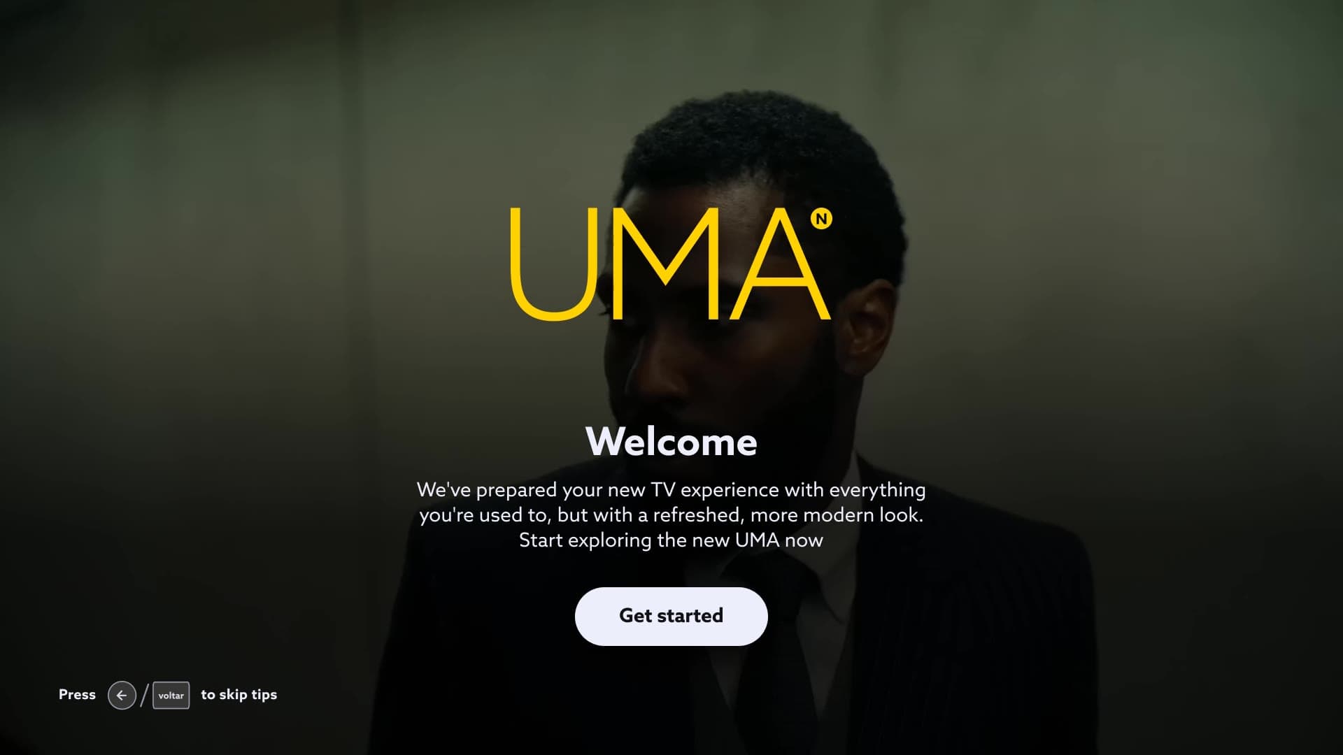
Video of the UMA welcome screen: yellow logo, “Welcome”, intro text and a “Get started” button; skipping the intro asks for confirmation and then shows where to find the introduction again in Settings. Player hints
Navigation tips at the first interaction with the new interface.
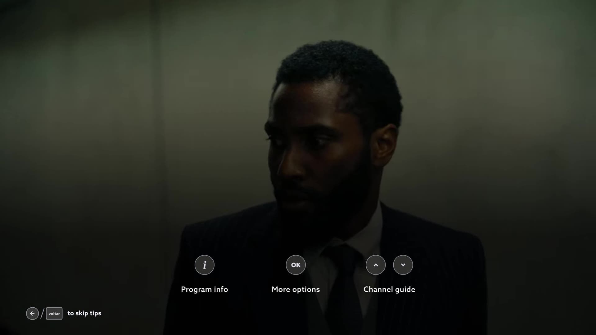
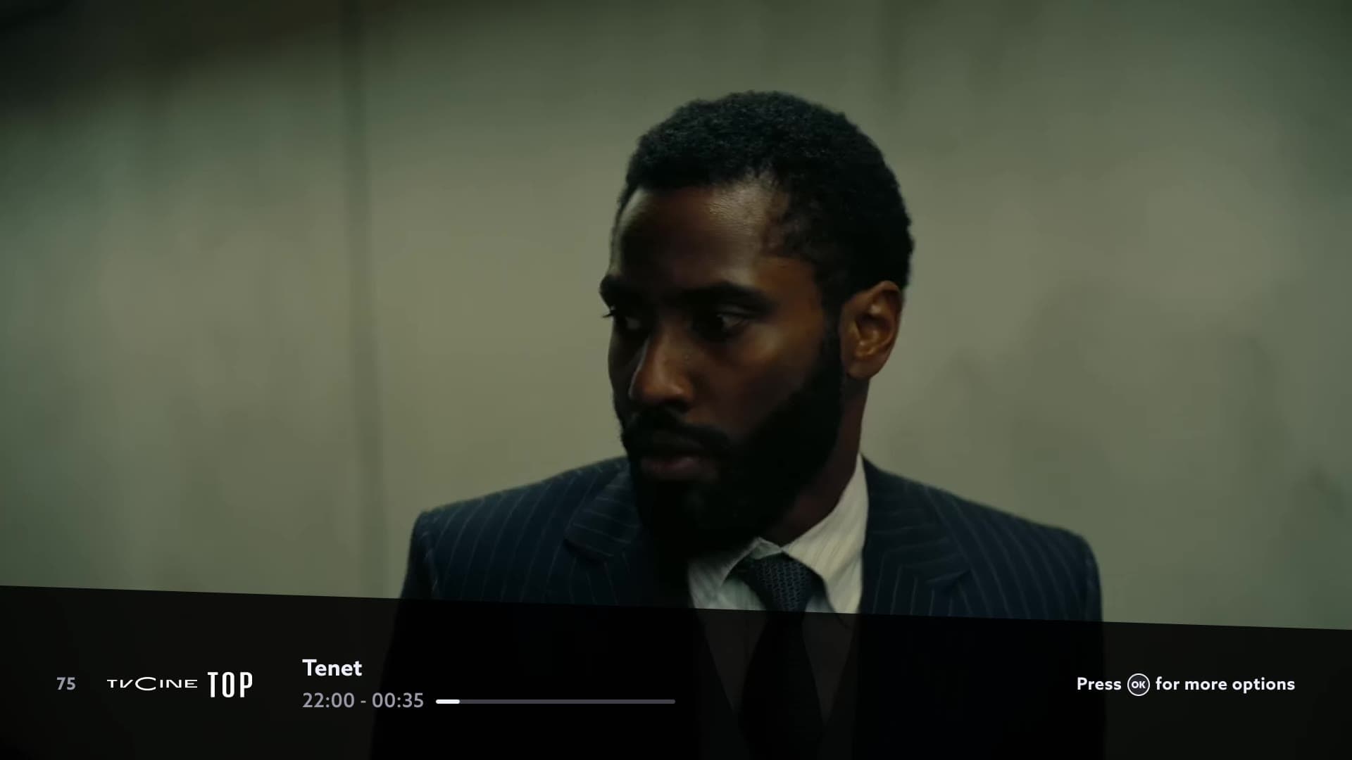
Video of the player with navigation tips (Program info, More options and Channel guide), followed by the walkthrough of the Tenet page: actions, cast and where the film is available. Walkthrough (also usable as a product tour)
Walkthrough steps are used in most onboarding cases.
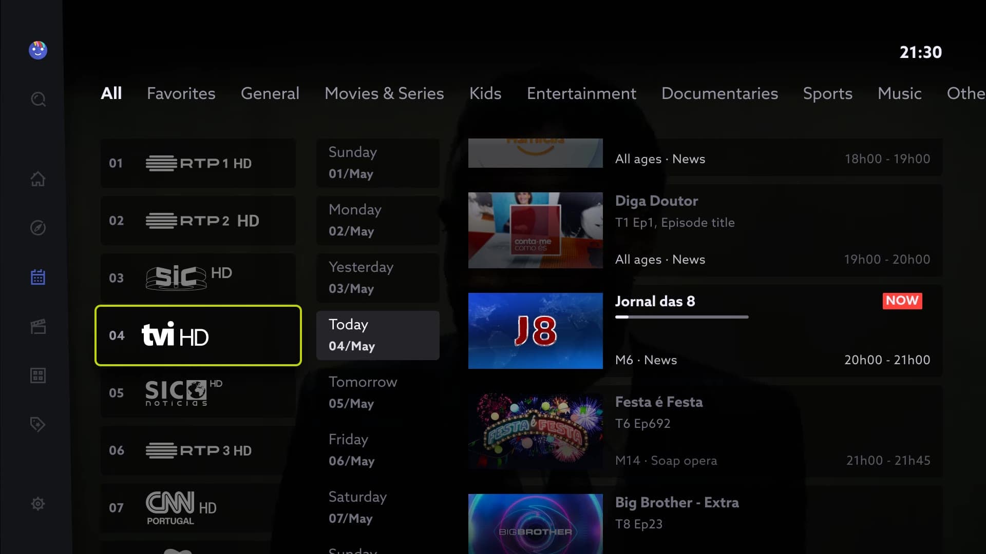
Video of the walkthrough in the programme guide, in 4 steps: TV channels, days of the week, shows and content, and category filters. Walkthrough with Now & Next (with highlight)
Used in more complex interfaces where we need to show the steps to complete an action.
The only difference from the regular walkthrough is the opacity.
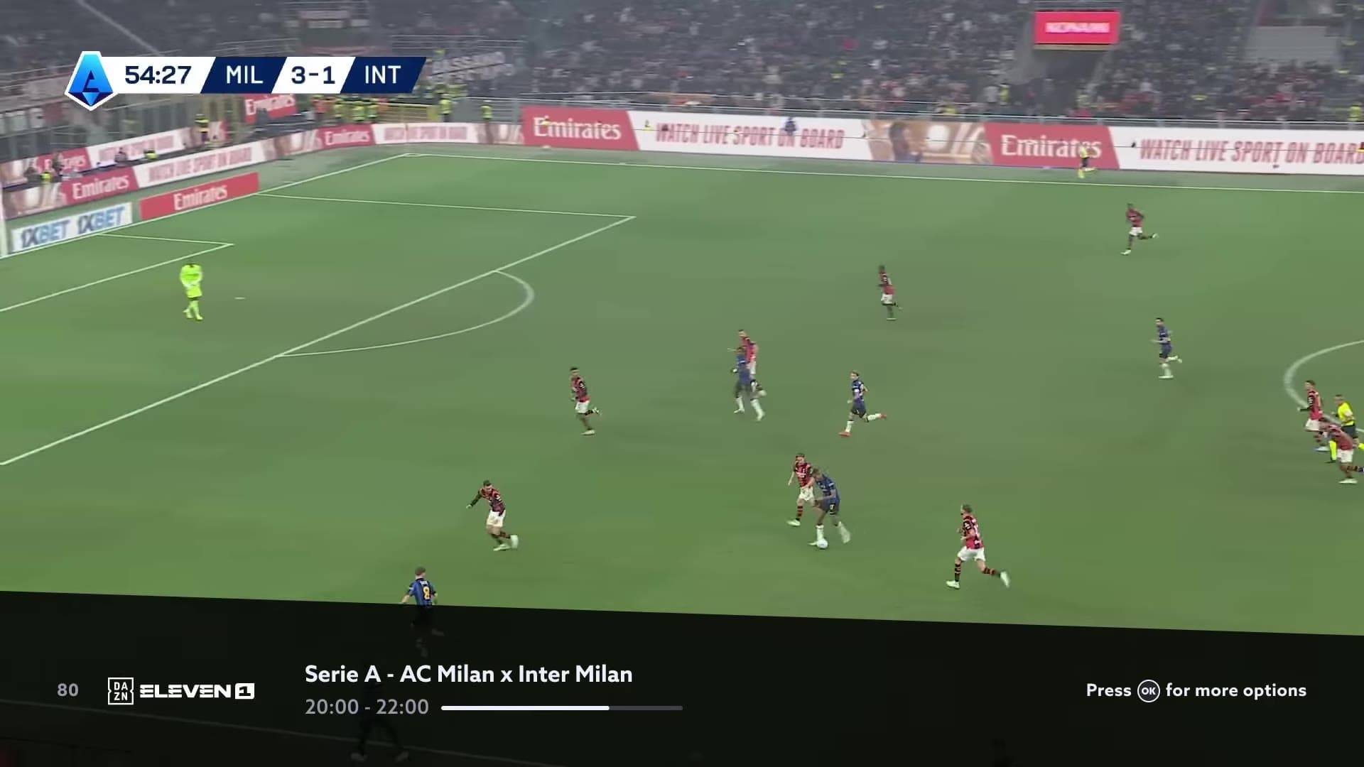
Video of a live football match where the match highlights walkthrough shows, in 2 steps, the best moments (goals, substitutions, fouls) and how to return to the live broadcast. Contextual tooltip
Tips give a short, direct explanation of an icon, area, button, etc. They can also draw attention to something new in the interface. They always appear before the action is taken.
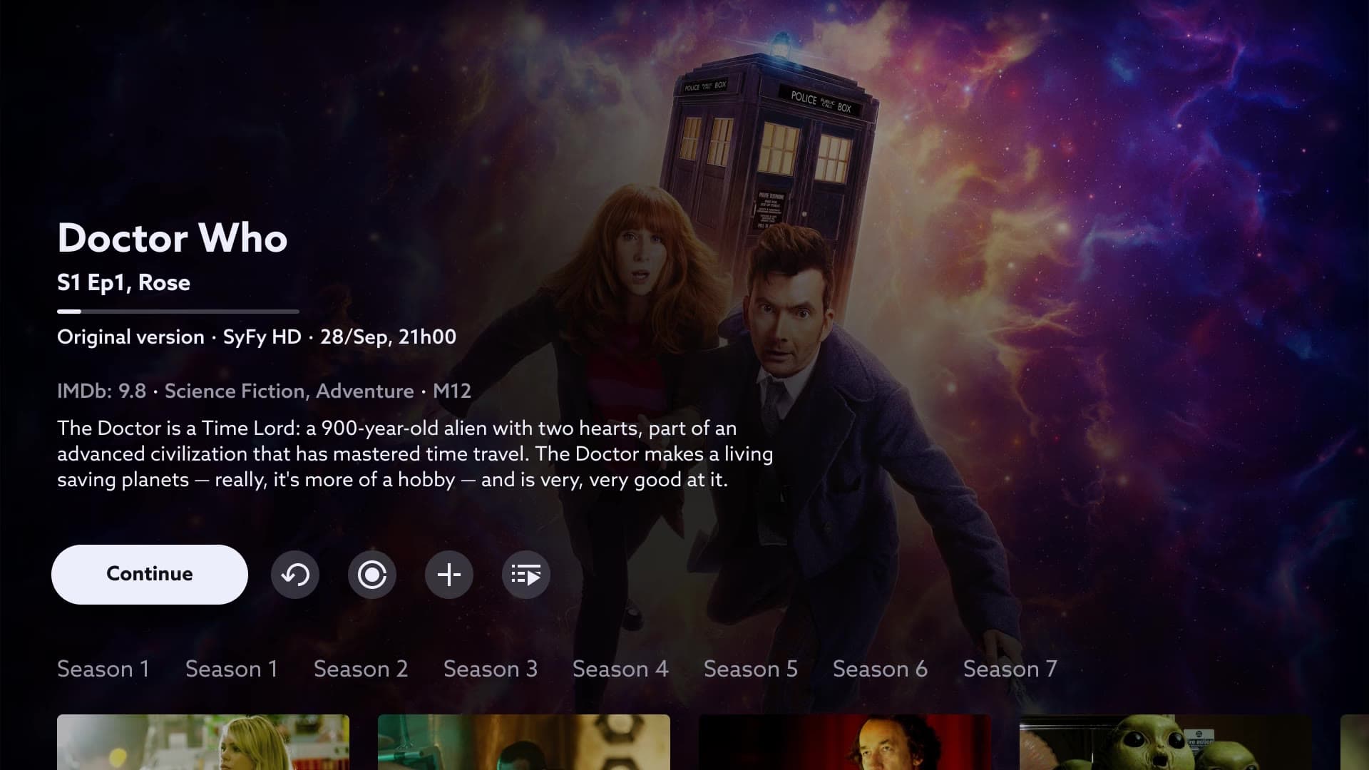
Video of the Doctor Who page where blue contextual tooltips appear as focus moves across the buttons: watch from the start, record, watch later and where to watch.
Usability test
Validating the onboarding with users
The usability test prototype focused on 3 flows: Live TV, Highlights and the EPG guide.
Each flow had related tasks for users to complete.
Test overview
6 out of 9 users struggled with the proposed onboarding
3 out of 9 users couldn’t complete at least 1 task with the walkthrough components
All users understood how the contextual tooltips work
Final decision
With a tight deadline to launch the new TV, I decided to adapt the onboarding to use only contextual tooltips, as they were the best-rated component.
Tooltips were set to appear only once, in important contexts or when there’s something new on the platform.
I also changed the Welcome screen and Player hints, merging them into a single introduction screen.
Welcome screen + Player hints
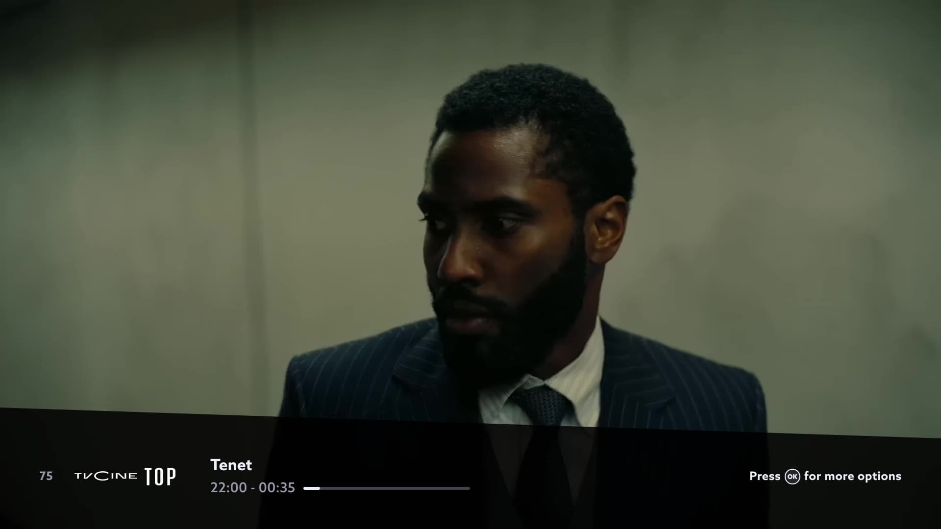
Video of the “Welcome to NOS TV” screen over the player, with hints for the remote buttons (rewind/forward, programme info, more actions and channel guide) and the button “Press any key to start watching TV”. Other flows
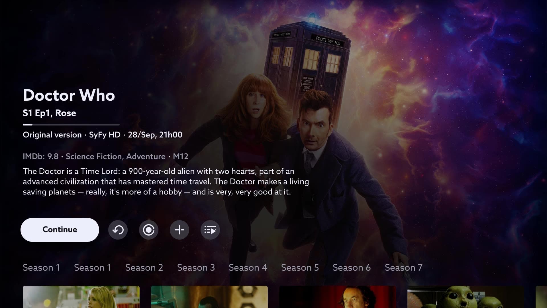
Video of the Doctor Who page where contextual tooltips appear on the buttons, such as “Watch from the start” and “Watch later”.
Final reflections
With the new TV launch very close, we had to prioritise a simpler onboarding that could be validated and delivered on time. It wasn’t the full vision we had designed, but it was the right call so the launch wasn’t delayed.
The project also changed how I see onboarding: less as a welcome tour and more as something spread across the journey, supporting users at the moment they need it.
What I would do differently
Onboarding personalised by persona
With a tight deadline, I had to choose between extending development or launching the TV with a single onboarding experience for every user. I chose to launch. Today, I would document personalisation as the next step on the roadmap so it wouldn’t get lost after the launch.
Prototypes closer to the real experience, using AI
The prototypes were built in Figma, which doesn’t reproduce remote-control navigation on a TV well. That took a lot of prototyping time and caused friction in the tests that wasn’t really about the design. Today, I would use AI to prototype in code, with real remote navigation, and test something much closer to the final product.